Main Content
Using Dashboards to keep an eye on your performance
We often hear: “what gets measured gets done”, but monitoring all the various aspects of your agency in real time can be quite challenging. Yet, without measuring we cannot tell if we met the target that was set out to achieve.
When it comes to tracking progress, to identify items that are impacting your overall performance and require urgent action, you need a centralised view of all your data and quick access to the relevant information, so you don’t have to rely on gut instinct and guesswork.
What are real-time Dashboards?
An effective visual representation of your performance in real time to get under the hood of your data and extract important KPIs in an accessible, easy to understand, way.
It allows you to instantly see what you are doing right and where you need to improve.
Do you need Dashboards?
 If you are looking for a quick way to highlight your goals or issues, track performance, and spot growth opportunities and risks instantly, Dashboards can help by providing you with a more joined up view of your data in one place.
It’s also an engaging way to deliver information to your team through colourful, interactive, and customisable charts and graphs.
Benefits of using Dashboards:
Increase profits
Monitor revenues and costs regularly
Boost productivity
See how projects are performing and establish targets to improve your operational processes
Collaborate effectively
Quickly inform all areas of your business and make it easy to collaborate within your team and across all departments
Make better strategic decisions
Use powerful insights to make better decisions
KPIs all in one place
Ensure that your agency goals are top of mind for everyone
At-a-glance view performance
Instantly access the latest results of your business performance and find out which areas are performing well and which ones require your attention
How to design effective Dashboards
– Make it visual and easy to understand
– Compare a set of data to make it more meaningful
– Keep it up to date
– Use filters such as “is the current week”
– Make it bespoke so it is relevant to each person in your team, and tailored to your needs and pressure points
What are the different types of Dashboards?
Bar charts: Great for comparing different types of sources
Count: A quick snapshot on how many items you have
Tables: Ideal for detailed overviews of data
Donut: A refined tool for in depth analysis
Line: Best for showing trends over time
KPIs: To see your Key Performance Indicators at a glance
Pie: Perfect for comparisons of select data
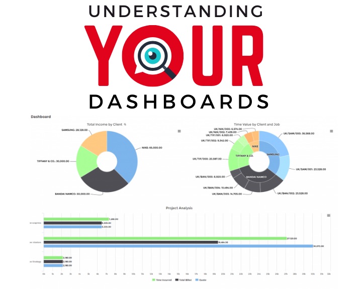
What are the most popular Dashboards?
Here are some examples:
– How many PO’s need to be approved or haven’t been invoiced yet?
– Total owed to suppliers
– Top 5 suppliers by outstanding payments
– Total amount of what’s due in the bank this month?
– Total income forecast by projects (by revenue or by clients)
– Use visual pie charts to spot areas that could lead to growth in your business
– Top 10 clients by fee income YTD
– Visualise and compare your actuals income against what you’ve budgeted
– Missing time
– Estimated hours planned vs worked
– Total billing by job manager
– Burn rates, things to do, holidays taken and remaining, and more…
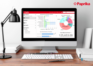
![]() This article was provided by Paprika, sponsor of the DBA Annual Survey Report. For more information about how their systems use Dashboards visit: paprika-software.com/why-paprika or contact them at info@paprika-software.com
This article was provided by Paprika, sponsor of the DBA Annual Survey Report. For more information about how their systems use Dashboards visit: paprika-software.com/why-paprika or contact them at info@paprika-software.com