DBA Roundup
A roundup of industry expertise, exclusive resources, business support and tools for your design business.
How are you feeling? Any particular highlights from the night, apart from winning?
Still grinning! Winning a DEA has been a career-long ambition of ours, but as a pure breed brand consultancy, we knew winning was never going to be easy. So to win not one but two awards (Gold & Silver) is a great achievement for us, and we haven’t stopped banging on about it since.
Beyond winning, we had an excellent evening catching up with our clients at London’s Air Ambulance and One Feeds Two, as well as the many old friends we bumped into at the ceremony. And Deborah’s speech was pretty damn good too! If you haven’t heard it, it’s on the Design Effectiveness Awards website, and well worth a watch.
Building on your article with the DBA from June last year, what was it exactly about attending the Awards in 2017 that spurred you to a) revisit your business model, and b) enter in 2018?
The Clearing is a new breed of brand consultancy firmly grounded in commercial reality. We’ve always worked with ambitious businesses helping them deliver their commercial ambition – growing revenue, increasing profit and entering new markets and it’s the strength of our ideas, creativity and strategic know how that enables us to do this.
That said while attending last year’s DEA ceremony it got us thinking about the way we talk about results – and we started being much more upfront about the way we talked about the impact of our work.
Also, our conversations with the DBA helped clarify the judging criteria which made us look again at recent projects where we created seismic shifts for two of our clients – from a new helicopter for London’s Air Ambulance to introducing national food partners to One Feeds Two.
What do The Clearing’s DEA wins mean for the company? Both internally and in terms of client relationships and new business.
Anyone working within the creative industry who tells you they don’t care what people think of their work is either lying or frankly, not good enough. As designers, we know how hard good ideas are to come by and how many of those good ideas are lost along the way. From college crits to client presentations, it’s the constant knocking of ideas that makes us designers such a fragile, insecure and needy breed.
So, at The Clearing, it’s important the team see their work celebrated, gaining the recognition it deserves across the industry. And I’m hoping the credibility our Design Effectiveness Awards bring will help accelerate our new business effort. I’ll let you know how that goes this time next year.
In your opinion, what do the Awards contribute to the design industry?
It’s quite simple, the awards celebrate powerful, commercially successful design – it’s design that means business.
And for the relationship or way of working between an agency and their client?
We always comment that we do our best work with our best clients and you can’t win a DEA without great clients, great work and a strong relationship.
What was the most difficult part of entering the Awards for you?
Knowing what to leave out. There’s always that tendency to cover the entire branding project from brief to solution – we had to focus on specifics, and on demonstrable change.
And the most enjoyable?
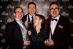
The Jagerbomb fuelled official winners photographs tell their own story.
What would you say to an agency similar to yours that is considering entering the awards?
Go for it! Focus on a project where your design work and thinking provided a pivotal point in a project and supercharged the outcome – because that’s the story the judges are looking for.
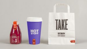
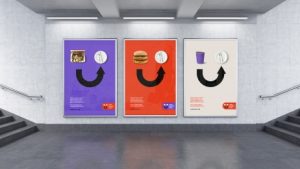 A brand-new logo, ‘The Smile’ was created during a brand refresh that challenged the ‘pulling on heartstrings’ tactic commonly associated with charities, and it clearly highlighted how even the smallest actions, such as buying a meal, can have a huge positive impact. Read on.
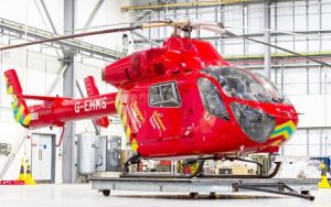 With only one helicopter in existence, 63 flying days were forfeited in 2015 due to maintenance, therefore acquiring a second helicopter became a strategic priority. But for a brand that relies on charitable donations, raising an additional £1.2 million per annum for another helicopter seemed an almighty challenge.
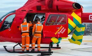
A strategic redesign of London’s Air Ambulance’s most iconic asset, its helicopter, was undertaken. The new livery turned the helicopter, as well as the rapid response vehicles, into powerful communications tools maximising awareness of the charity. Read on.


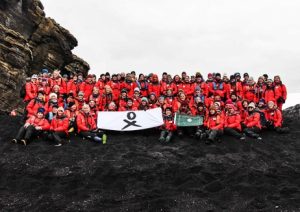 Homeward Bound is a ground-breaking project aimed at advancing the role of women in science. They had a huge mission on their hands – to increase the influence of women in climate change decision-making.
The representation of women in science global leadership roles is a minimal 15%. When you consider that these decisions impact how our planet is affected, it’s obvious why women who have focused their careers on science and the environment were frustrated. They wanted to see change. They wanted to increase diversity in leadership teams to share more ideas on tackling climate change.
The initiative saw a team of women embark on a year-long awareness programme, followed by a 20-day expedition to Antarctica. It’s the only global network of women devoted to changing the way we care for our planet, and the ambition is to recruit 1,000 women over the next 10 years to create a powerful network that influences the gender balance in policy making.
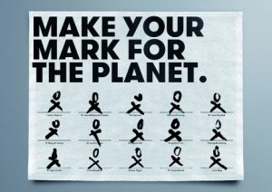 To gain significant outreach and change perceptions of women in science, they needed a brand identity. It was essential that it highlighted how women can lead climate change conversations, and engage hundreds more to join the collaboration. It needed to be emotive and uplifting, both for women and men.
Starting with the symbols for male and female and weaving the idea of ‘X’ being a kiss and ‘O’ being a hug, agency Elmwood created a strong visual sign that speaks to both genders. Hand drawn, it’s easy to recreate, and acts as a pledge.
They also went one step further, creating an overarching idea to drive the campaign. This headline, ‘Mother Nature Needs Her Daughters’, became the rallying cry for the brand, establishing a unified voice. It enabled them to go beyond the power of the brand to start conversations and galvanise women from all backgrounds. The idea was brought to life through videos that asked, ‘What would you do if your mother was sick?’.
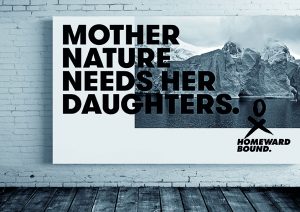 In the first month, the campaign reached 76 million people. To date, it has reached over 450,000 million – and that’s with no advertising or media spend. It is more than the cumulative media coverage recorded for women in science – ever.
The expedition featured in a 2016 documentary, Beautiful Minds, which investigated what the world would look like if more women had a seat at the leadership table. Homeward Bound has since been selected to be part of an initiative that connects films with philanthropists looking to positively change the world.
Gender power balances are starting to shift, too. Since the programme launched, Deborah Pardo, one of the participants, has been nominated as one of the 20 most influential women in France. A future participant, Adriana Humanes who generated significant media coverage on the back of her involvement with Homeward Bound, was invited to act as a commentator and adviser following an oil spill in Trinidad.
Hundreds of women from more than 10 countries have been added to the waiting list for the second expedition, which is going to be recorded in a new book.
2018 DBA Design Effectiveness Awards: Gold Award Winner
View all of the 2018 winning case studies at effectivedesign.org.uk and sign up to receive details about entering the Awards via awards@dba.org.uk


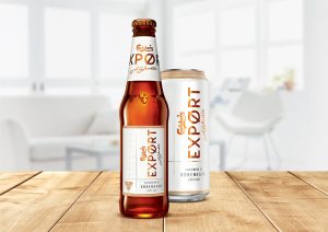 Carlsberg was having an identity crisis. For millennials, the beer was known for its humorous advertising but little else. It lacked relevance in a world of discerning drinkers who are increasingly clued up about different beers. Premium outlets had started to shun the brand completely, favouring it for seemingly upmarket rivals and if it did manage to hold its position on the shelf, it would be priced low as a cheaper option compared to the likes of Peroni, Birra Moretti and Brooklyn Lager. This was having a detrimental impact not just on sales, but staff morale too.
Although the UK is the biggest market for the Carlsberg brand, the drinking market in the UK itself has waned. Over the last five years, the standard and premium lager market has shrunk by 3.2 million hectolitres, taking almost £300 million out of the category. The industry has reacted by slashing prices, which has had a negative impact on profits.
As the fourth largest brewer in the world, the first to discover a purified yeast for brewing and the creators of the pH scale, Carlsberg are experts. But all of this was lost in the haze of its mainstream image, with the brand now seen as lacking relevance and credibility.
Something needed to be done to reinvigorate Carlsberg. The answer lay in a new proposition and premium rebrand by Taxi Studio.
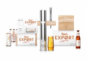 In the UK, people associate Scandinavia with smart, happy, good-looking people, a love of nature and style. It’s seen as an effortlessly cool place, and by focusing on the brand’s Danish roots with the new proposition ‘Carlsberg From Denmark With Love’, Carlsberg could translate the premium, high-quality nature of the beer.
Carlsberg Export was chosen to lead the new proposition and the backbone of its new design centred on the Dannebrog, a military symbol in a simple cross system. Using a blend of colours and textures inspired by the Danish concept of hygge with copper, wood and ceramic white, the result was a brown bottle, white label and copper-toned wording. It sends out a clear message: Premium.
Scrapping the green bottle in favour of brown was a bold move. Green glass has been a mainstay of the brand for 170 years, but the brown bottle gave consumers a more crafted, quality perception.
Carlsberg had three objectives with the rebrand – bring back distribution losses from outlets, stabilise profit growth and establish a premium brand. In just 14 weeks they not only achieved all three, they in fact delivered significant growth.
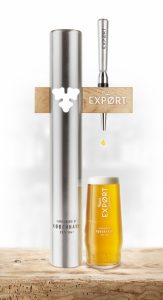 Before the new packaging, Export had 3,240 distribution points in Grocery customers. This jumped to over 9,000 in only 14 weeks after launch – a 170% increase in a remarkably short time. It’s important to recognise that the new distribution points are all considered the ‘right’ kind for the Carlsberg brand vision. Significantly, Export has managed to gain a place on Sainsbury’s shelves having been delisted for five years. These big wins, including being relisted in Waitrose, have helped stabilise gross profit and they have since grown by 2% on every hectolitre sold.
In Impulse customers the Carlsberg Export brand has grown distribution by over 10% to now be available in over 43,000 distribution points. And a wider halo effect is being felt by the Carlsberg brand with gross profit growth up on the previous year.
Carlsberg Export also has the highest pence per litre against competitors such as Stella Artois, Budweiser, Kronenbourg and Amstel. It is deserving of the price difference because brand perception has increased – the statement ‘More stylish than other brands’ was up by 9%.
All of these successes came within just three months without any other communications support. Carlsberg has earned its stature based purely on its clear, contemporary, beautiful design, and has won the hearts and minds of trade customers, consumers and the internal audience alike.
2018 DBA Design Effectiveness Awards: Grand Prix and Gold Award Winner
View all of the 2018 winning case studies at effectivedesign.org.uk and sign up to receive details about entering the Awards via awards@dba.org.uk


 With a 170% increase in distribution points in only 14 weeks, Carlsberg UK and Taxi Studio won the prestigious Grand Prix Award for the brand reinvigoration of Carlsberg.
Says Chairman of the Judges, Andrew Summers, “Carlsberg’s story shows just how design can turn around an ailing brand. A new proposition and premium rebrand oozed style and simplicity and have taken Carlsberg back to its roots. In a remarkably short time, Carlsberg turned from decline to growth, capturing the hearts of consumers and retailers.”
All 54 winning case studies can be viewed at www.effectivedesign.org.uk
Hosted by award winning journalist and broadcaster Samira Ahmed, with the keynote speech given by the Rt Hon Matt Hancock MP, Secretary of State for Digital, Culture, Media and Sport, the DBA Design Effectiveness Awards celebrate the power of design to drive business success.
Rt Hon Matt Hancock MP, Secretary of State for Digital, Culture, Media and Sport says, “Now more than ever, British design and innovation is shaping the world we live in. The DBA Design Effectiveness Awards are an annual recognition of some of the best of British design talent, and I congratulate all winners of this prestigious celebration of British creativity.”
In today’s challenging, fast moving markets with ever more discerning customers, design’s power to drive business success has never been more relevant. The DBA Design Effectiveness Award winners prove why design is a commercial imperative for any business of any size or sector.
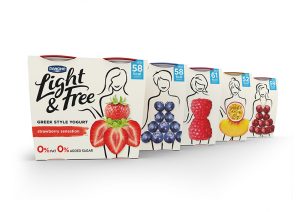
At a time when many businesses are struggling to identify where future growth opportunities will come from, Danone’s Light & Free is an example of a global business valuing design’s intrinsic ability to react to the challenges of changing markets to unearth opportunity and drive growth.
With perceptions towards health changing, Light & Free’s stylish design by Dragon Rouge won over millennials. Smashing the rules of the diet category, 3.9 million households tried the brand within 32 weeks and it achieved the highest penetration of all yoghurt innovations in the last four years. (Gold Award winner)
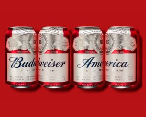 As customers become ever more selective, their personal reaction to a brand, business or service can be pivotal to success. For AB InBev’s Budweiser, achieving an emotional connection with consumers with its bold ‘AmeriCan’ design reversed the brand’s sales declines, delivering sales volume growth for the first time since 2015. The limited edition packaging design by Jones Knowles Ritchie created vast amounts of media buzz – it secured 1.6 billion earned impressions worldwide and was seen by more people than the 2015 and 2016 Super Bowls combined. (Gold Award winner)
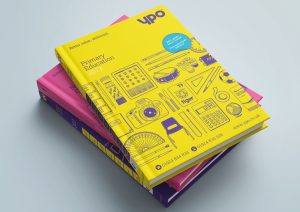 In a post-Brexit economy, design will be a critical driver for growth. As buying organisation YPO has seen, design investment can be a catalyst for business expansion – opening up markets and growing workforces. YPO’s new proposition ‘Public Value Champions’ and branding by Thompson Brand Partners elevated its profile nationally. A more modern, sophisticated personality resulted in 384% increase in associate members (up from 13 to 63) and its UK wide growth has seen its workforce swell by 12% with 57 new jobs created. (Gold Award winner)
 With rapidly changing markets, once thriving businesses and brands can find themselves losing relevance. Design can reinvigorate a business back to growth, as Taxi Studio’s contemporary new design for Carlsberg demonstrates. With a shrinking lager market and a rise in discerning drinkers searching for premium alternatives, Carlsberg was in crisis, losing its position at the bar and on the shelf. Carlsberg Export’s new premium feel, transformed its outlook. Before the new visual identity, Export had 3,240 distribution points in Grocery customers – within only 14 weeks of launch it had over 9,000 and most significantly was re-listed in Sainsbury’s after a five-year absence. (Gold Award winner)
 Customer and citizen decisions hinge on a business or service’s power to persuade and Elmwood’s brand identity and awareness campaign for Homeward Bound did just that. With a vision to increase the influence of women in climate change decision-making, Elmwood and Homeward Bound created an emotive identity and message ‘Mother Nature Needs her Daughters’. The rallying cry sparked conversations globally: over 450 million media impressions have been achieved to date with no media or advertising-spend and the movement has had more than the cumulative media coverage recorded for women in science, ever. (Gold Award winner)
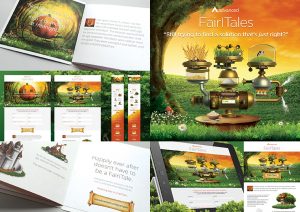 In any marketplace, only one business or brand can be the cheapest, the others need to differentiate to stand out from competitors and succeed. Software provider Advanced and Graymatter certainly achieved this with their highly unique and creative approach to a new proposition ‘right-first-time-solutions’. To achieve greater recall amongst their CEO target, they gave the campaign a humorous and creatively driven twist. FairITales was a risky strategy, but it had a happy ending: a sales pipeline of £3.93 million was achieved, 293% up on a target of £1 million. (Gold Award winner)
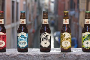 As a fresh-faced start up business, Brew York needed to build recognition in a highly competitive market. United by Design’s eye-catching branding and packaging delivers shelf-standout and enabled Brew York to smash its five year production growth plan within only 16 months. The speed of on and off trade sales have resulted in the craft brewery exceeding their business plan over three years early and entering the top 45% of SIBA (Society of Independent Brewers) members for the highest turnover, within the first year of trading. (Gold Award winner)
 Raspberry Pi’s Official Case for their low-cost, high-performance computer has created a world of opportunity and demonstrates how potent the addition of design to a technology product can be. In just two years the sleek, fun case designed by Kinneir Dufort has generated profits of £725,000 for the Raspberry Pi Foundation. But beyond that, it has also created new ways to bundle the core products to reach new consumers, and whilst not setting out to become a brand, the Official Case has strengthened Raspberry Pi’s position by creating a distinct and recognisable visual identity. (Gold Award winner)
In addition to the Grand Prix which was won by Carlsberg and Taxi Studio for the brand reinvigoration of Carlsberg, two other special awards were presented on the night.
Elmwood received the Top of the League Award recognising the most impressive cumulative performance from an agency over the last three years.
And the International Export Award, which is presented for the most effective piece of work undertaken by an agency for an overseas client, went to Zumtobel Group and GW+Co for THORNeco: Meet the family.
This year’s judging panel included Paul Edwards, Head of Design and Brand Management, Airbus, Peter Fossick, Service Design Programme Director, IBM, Julie Dixon, Head of Marketing and Communications, Transport for London, Elif Yigit, Country Marketing Director UKIRE, HP, Bruce Daisley VP EMEA, Twitter, Darren Henley, Chief Executive, Arts Council England, Caroline Norbury, Chief Executive, Creative England amongst other leading figures. View the full judging panel
To receive further details about the Design Effectiveness Awards and to register your interest to enter, please email awards@dba.org.uk
| Trophy | Business | Agency | Project title | Industry sector |
| Silver | Maplin | 20.20 | Maplin: Store of the Future | General retailers |
| Bronze | Bergen International Festival | ANTI Bergen | Bergen International Festival Rebrand | Charity |
| Gold | Pip & Nut | B&B studio | It’s The Nuts | Food Producers |
| Bronze | Diageo India | Bloom | Royal Challenge: Engaging a New Generation | Beverages |
| Silver |
Maxxium España |
Brandhouse | Larios: The Mediterranean Gin | Beverages |
| Gold |
Dairy Crest |
BrandOpus | Vitalite | Food Producers |
| Bronze |
McCain UK |
BrandOpus | McCain Shake Shake Fries | Food Producers |
| Silver |
Ernest Jackson & Co / Mondelēz International |
Bulletproof | Bassetts Vitamins Redesign | Food Producers |
| Bronze |
PizzaExpress |
Bulletproof | PizzaExpress Retail Range Redesign | Food Producers |
| Silver |
Marston’s |
Butcher & Gundersen | Wainwright: The Golden Beer | Beverages |
| Bronze | Unilever Comfort | Coley Porter Bell | Comfort Summer Limited Edition | Household Goods |
| Silver |
USP Zdrowie |
Creative Leap | Inovox Express | Pharmaceuticals & biotechnology |
| Bronze |
RB |
DCA | Air Wick Scented Oil Warmer | Household Goods |
| Silver |
The Travelling Bee Company |
DECIDE. | The Travelling Bee Company | Food Producers |
| Gold |
Four Winds |
Denomination | Four Winds Vineyard | Beverages |
| Silver |
Unilever |
Design Bridge | Matcha Green Tea: Reinventing a Classic | Beverages |
| Bronze |
Essity |
Design Bridge | Tena Men: Tackling a Taboo | Personal Goods |
| Gold |
Danone |
Dragon Rouge | Light & Free Yogurt | Food Producers |
| Gold |
Homeward Bound |
Elmwood | Our Planet in Our Hands | Education |
| Bronze |
Day One |
Elmwood | Signposting The Journey Back To Life | Charity |
| Silver |
London Beer Lab |
Elmwood | Raising The Bar For London Beer Lab | Beverages |
| Bronze |
Mars |
Elmwood | Golden Eggs | Food Producers |
| Gold |
Procter & Gamble |
Elmwood | Fairy Cleans up for P&G | Household Goods |
| Bronze |
Dubai Airports |
Engine Service Design | The Dubai Airports Hospitality Programme | Travel & Leisure |
| Silver |
The Dell |
Good | Branding The Dell | Travel & Leisure |
| Gold |
Advanced |
Graymatter | FairITales | Software & Computer Services |
| Gold |
Zumtobel Group |
GW+Co | THORNeco: Meet The Family | Electronic & Electrical Equipment |
| Silver |
Java Republic |
Honey | Java Republic: Something’s Been Brewing | Beverages |
| Silver |
GSK |
Interbrand | Sensodyne True White | Personal Goods |
| Gold |
AB InBev |
Jones Knowles Ritchie | Budweiser: Taking Back The ‘AmeriCan’ Summer | Beverages |
| Silver |
Buttermilk Confections |
Kingdom & Sparrow | Buttermilk Rebrand | Food Producers |
| Gold |
Raspberry Pi |
Kinneir Dufort | Raspberry Pi Official Case | Technology Hardware & Equipment |
| Bronze |
Lund Halsey |
LA Design | Kontrol Command – Control Room Consoles | General Industries |
| Bronze |
Tata Global Beverages |
Landor | Brewing Warmth & Growth For Tetley | Beverages |
| Silver |
Hagkaup |
M Worldwide | Hagkaup Smaralind: Happy Shopping! | General Retailers |
| Bronze |
Imperial College Business School |
OPX | Imperial College Business School Visual Identity | Education |
| Silver |
Cornerstone |
Path | Cornerstone: Delivering a Smooth Shave | Personal Goods |
| Silver |
Interflora Denmark |
Pearlfisher | ASK: Beer From Interflora Denmark | Beverages |
| Gold |
Seedlip |
Pearlfisher | Seedlip: The Art of Nature | Beverages |
| Gold |
Nestlé USA |
Pearlfisher | Putting The Love Back Into Lean Cuisine | Food Producers |
| Silver |
Sadler’s Wells |
Red&White | Sadler’s Wells | Media |
| Bronze |
Glasgow Prestwick Airport |
Stand | Repositioning Glasgow Prestwick Airport | Travel & Leisure |
| Silver |
The Tofoo Company |
Stormbrands | The Tofoo Company | Food Producers |
| Gold |
Carlsberg UK |
Taxi Studio | Carlsberg: A Story of Brand Reinvigoration | Beverages |
| Silver |
AEG Powertools |
The Canopy Studio | AEG Powertools Warranty Campaign | Construction & Materials |
| Silver |
London’s Air Ambulance |
The Clearing | London’s Air Ambulance | Charity |
| Gold |
One Feeds Two |
The Clearing | One Feeds Two | Charity |
| Silver |
James Heal |
Thompson Brand Partners | James Heal: Setting The Standard | Industrial Engineering |
| Gold |
YPO |
Thompson Brand Partners | YPO: Public Value Champions | Public Sector |
| Gold |
Brew York Craft Brewery |
United by Design | Brew York Craft Brewery Brand Packaging | Beverages |
| Silver |
Waitrose |
Waitrose Graphic Design | Waitrose 1 | Food & Drug Retailers |
| Silver |
Hi Mark International – Body Sculpture |
WPA Pinfold | Body Sculpture | Health Care Equipment & Services |
| Silver |
Bulwark |
WPA Pinfold | Bulwark: The New World Cider | Beverages |


